Designing for higher conversion
Using persuasive design patterns
to boost conversion

Summary
Annual Insight provides consultancy about markets or competitors for middle scale companies in the Netherlands. In their current situation all their leads were generated by cold calling companies and our mission was to generate leads in other ways.
Challenge
Redesign the marketing website to generate leads and change the positioning of the company.
Outcome
The marketing website was redesigned using persuasive design patterns to boost the conversion. Beside adding persuasive patterns we made the brand more consistent, changed the main goal of the marketing website, and broadened the position of the company.
Year
2020 (3 weeks)
Role
Web designer
Services
Research
Branding
UI design
UX design
Research
To find out what the scope is of the project we did a workshop with the client that is based upon the design sprint. In this workshop we do exercises to find out what kind of problems the client has, which direction they would like to go, target groups, and what they want to accomplish.


Persuasive design patterns
To help generate more leads we decided to redesign their marketing website and use design patterns to persuade the target group to sign up for a demo or plan a sales call. After the research on persuasive patterns was finished we decide to use the following patterns.
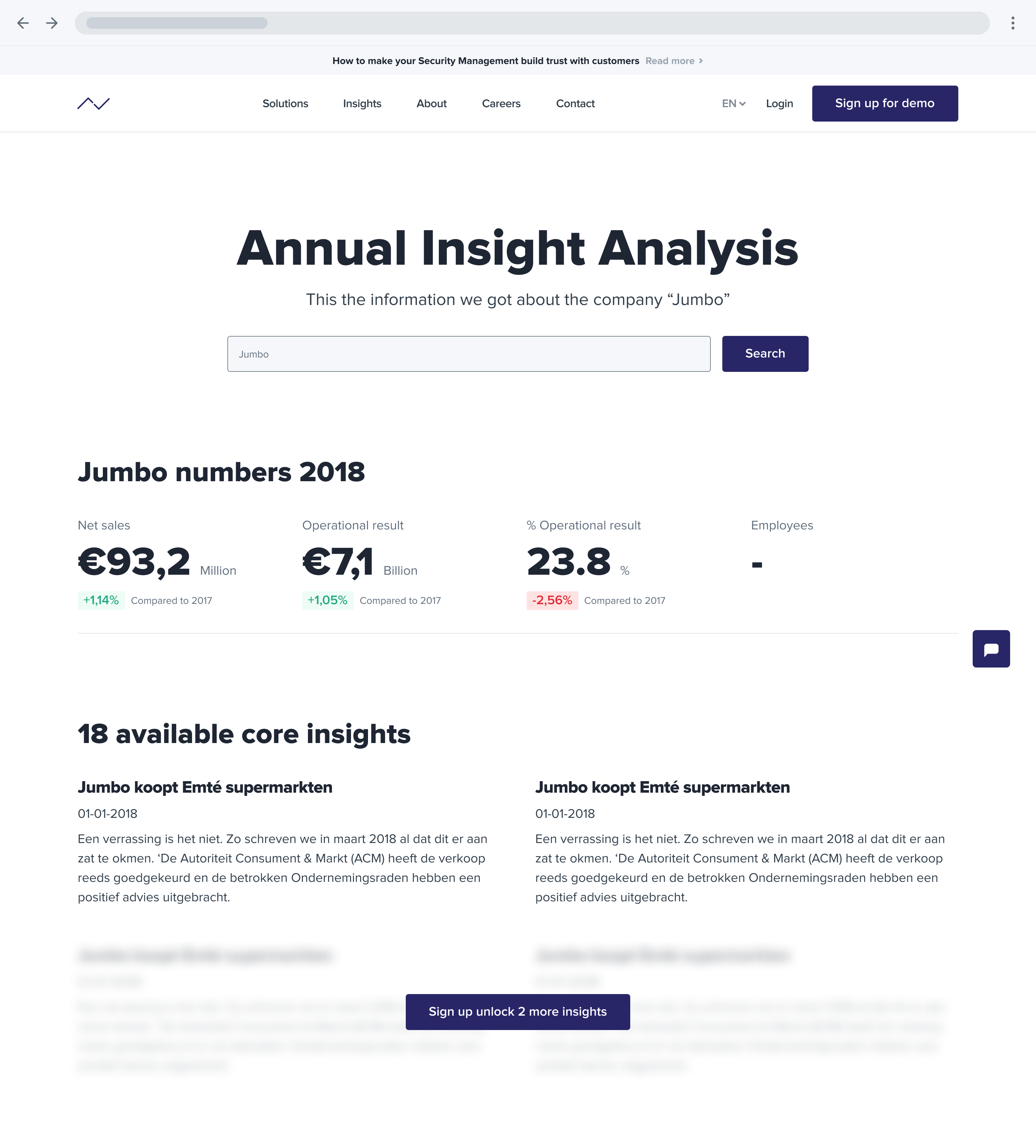
Fixed rewards
Together with the client we discussed how we can show the value the client can add for their customers. Therefore we decided to make it possible to show customers what kind of insights they can provide but letting them search for companies and show them two insights. The two other insights about the company they searched for would be unreadable and would only be shown when they would sign up for a demo.

Authority
Winning trust from your potential customers is key for converting them into leads. To create authority we decided to go for adding testimonials, preferably from a respected customer.

Social proof
Increasing your credibility and showing that your product is used by other companies where potential customers can relate to we added the social proof pattern to the website.

Reputation
By sharing relevant information like online articles, white papers, host knowledge sessions or networking events. For this project we decided to start building a reputation by giving focus on sharing knowledge.


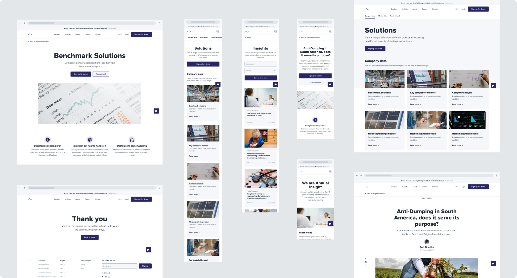
Design
As the planning was tight on this project we divided the design phase into different themes so we focus on one part of the design, collect feedback, make iterations, and get sign off.
Structure & Interactions
The theme for the first days was website structure. In these first days we created a sitemap, page structure, and thought through the interactions.


Layout theme
With the insights from the research worked out, decided which design patterns to use, and structure clear the layout theme started. Deliberately we choose to only make greyscale designs to help the client solely focus on the layout and structure which makes it easier to give feedback for them.

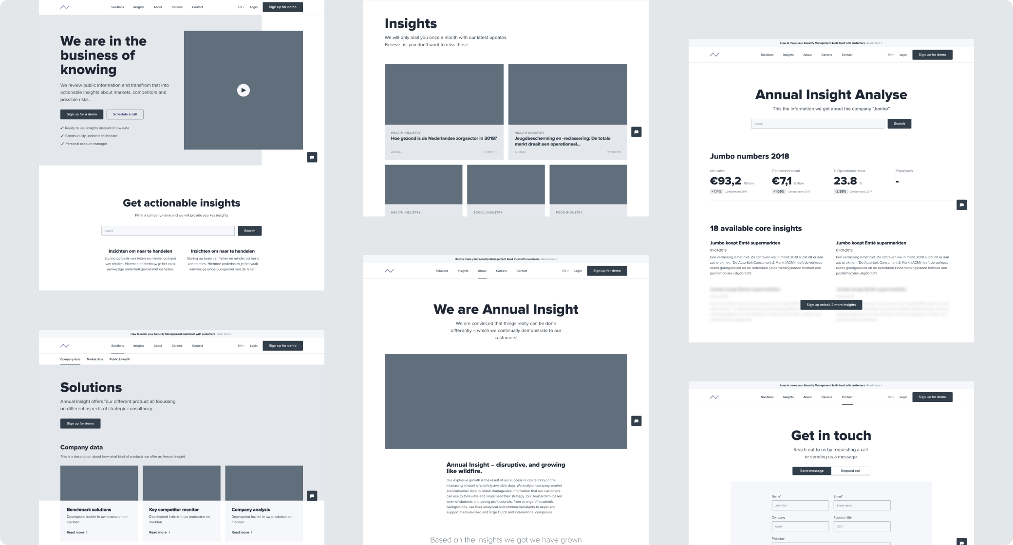
Based on collected feedback from design critiques and sessions with clients we held twice a week the layout was changed to better fit on different screens and devices. The home page got restructured to focus more on building trust early on and showing how the client adds value for their customers. Simultaneously next to designing the layout we started creating a component library for development.
Design decisions
- Changed layout so it became better responsive and easier to adapt to other screen sizes and devices
- The header image on the home page became a testimonial video to build trust earlier on
- Search bar to be able to find insights from their database higher on the home page to show what kind of value they can add for companies
Branding theme
Their current products and website were using different color, spacings, fonts, and photos which let to an inconsistent brand. We started by comparing all used elements and removing all inconsistencies to simplify it. Afterwards we started building out a system for colors and images. This helped setting boundaries during this redesign but also with keeping the brand consistent after this project.

Final design