Redefining how people
buy perfume online
Designing a more personalised online experience around perfume
Summary
Parfum.nl has been selling perfumes and other cosmetic products for years but recently changed course. An investor took over and hired the agency where I worked to improve the user experience around buying cosmetic products online.
Challenge
Design a better user experience that adds value for the customer.
Outcome
We researched the perfume buying process and designed a new online experience which resulted in a more personal shopping experience for the different user groups by adding features like dynamic landing pages, extensive search, and price transparency.
Year
2020 (3 months)
Role
Product designer
Services
Research
Concept
Branding
UI design
UX design
Research
We kicked off the design phase with a workshop to find out what the goals were of the client and which direction they wanted to go. During multiple exercises we found out what what the client wanted to achieve, their main focus, target groups, how they would like to position them self in the market, and what kind of branding they were searching for.
All information from the meeting were translated in the following insights.


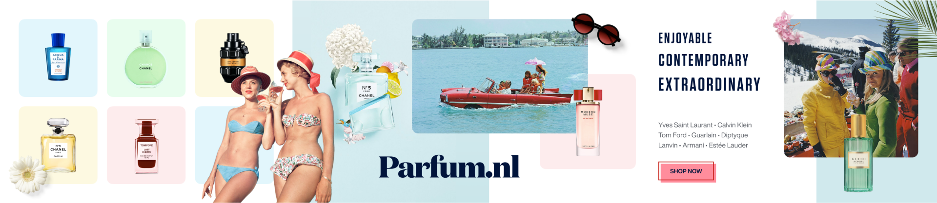
Branding
We proposed different branding possibilities by making stylescapes. Stylescapes give more context than mood boards and styleguides so it gives a better idea of what the end result would be. For every stylescape we choose three keywords that we picked up during the workshop and tried to make three totally different styles to show how much room there is.
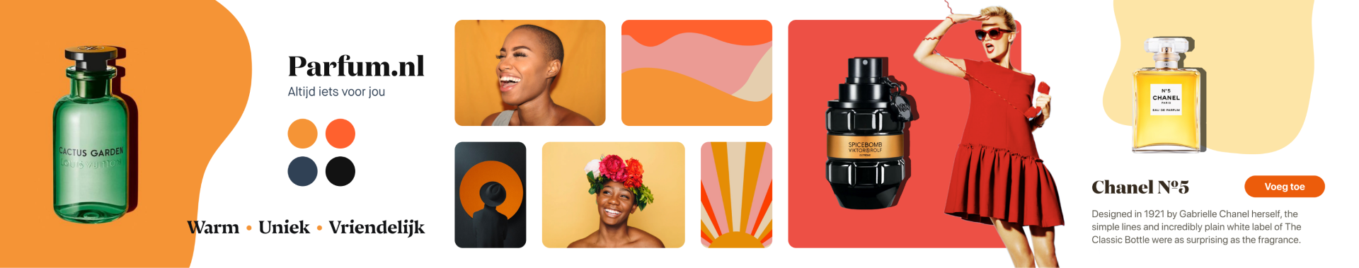
Decision
The client choose to go with the third stylescape as it was the most approachable, fresh, not too extravagant choice. This would best fit their main target group but still be generative enough for other people.

Buying process research
We researched the online and offline experience of buying cosmetics through interviews with the target group and observing customers buy products in cosmetics stores. From these research methods we could extract the following insights.
Extracted insights
- Customers mostly buy cosmetic products online that they know
- Customers go to stores to get advice on products and a more personal experience
- Customers go to stores to discover new products
These insights led us to divide the target group in three different user groups where we would focus on.

The experts
The experts already know what they would like to buy and are looking for the best price.
The Learner
This group knows what kind of products they like but want to learn more about other likewise products.
The amateur
The amateur does not have any knowledge of what kind of the product they would like to have.
Ideation & Concept
Together with the Parfum.nl team we brainstormed concepts during weekly sessions to come up with ideas to help the different target groups reach their goal as fast as possible and create transparency to build trust. The ideas from the sessions were formed to different features that helped build the concept.
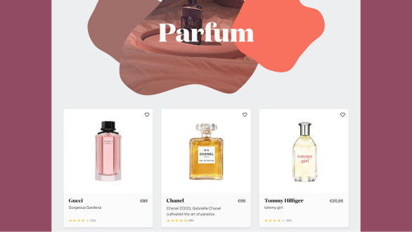
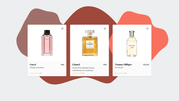
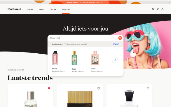
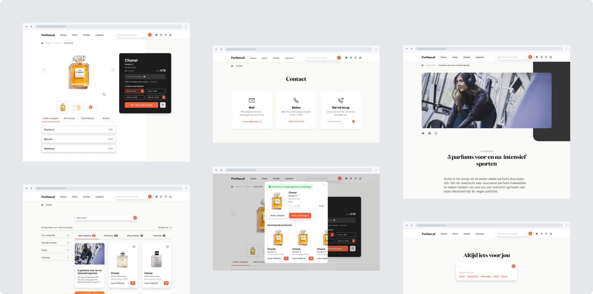
Extensive search
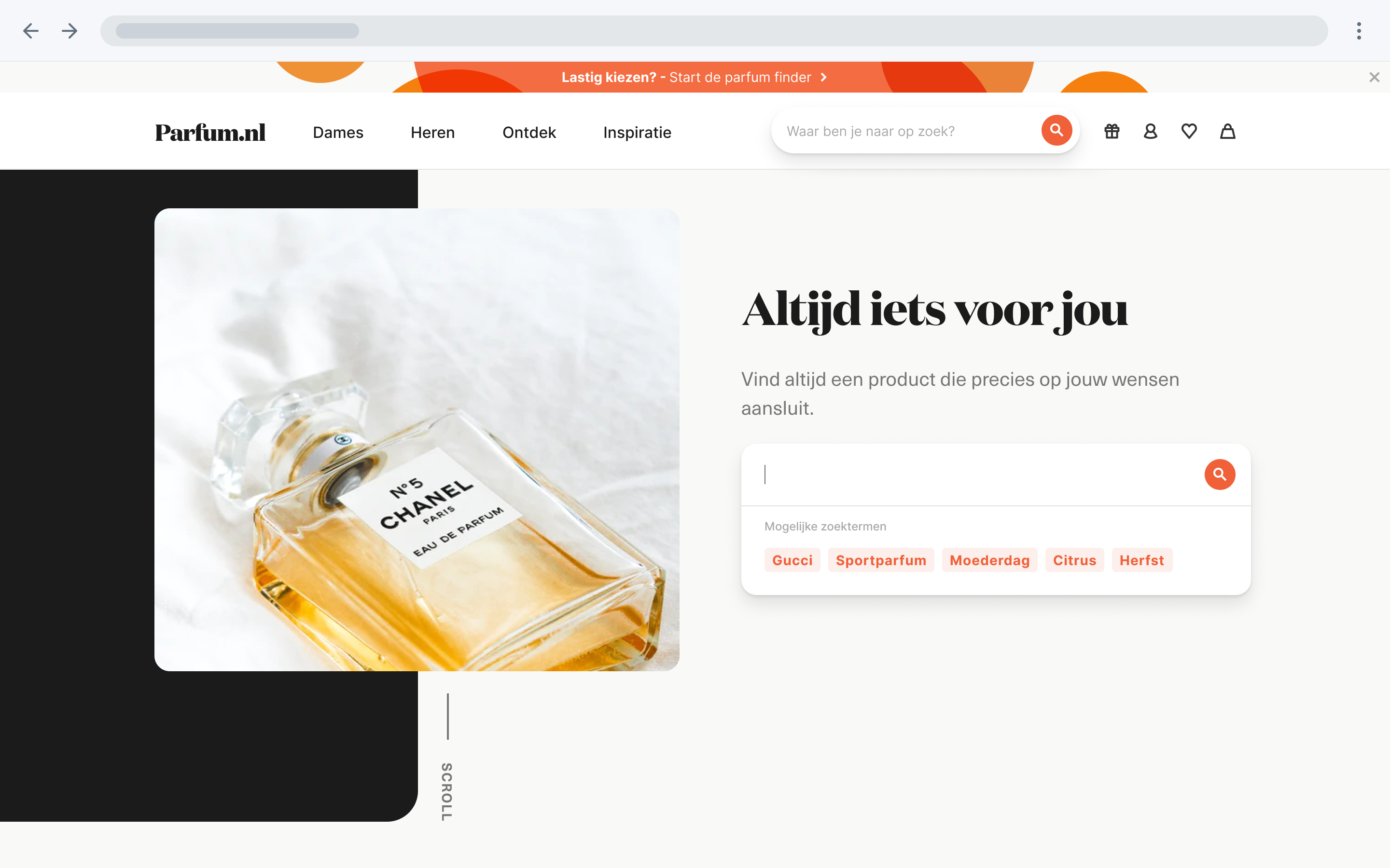
Experts main goal is to find the product they want fast and order it, to accommodate this need we designed an extensive search bar that we place directly on the landing of the home page. When the user types within the search bar we give suggestions and show next to products also related information like blogposts and landing pages.

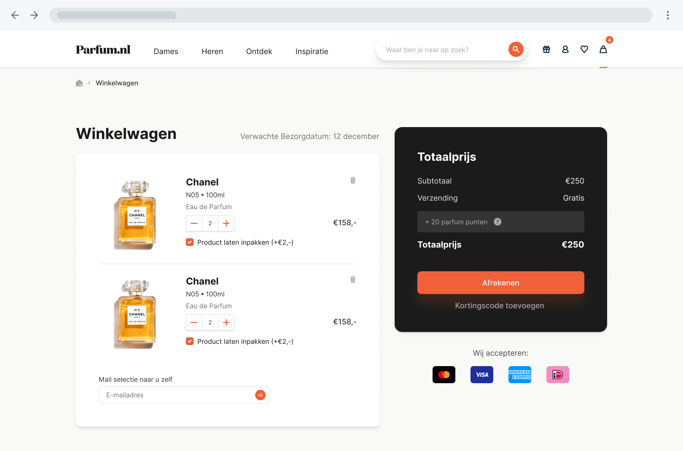
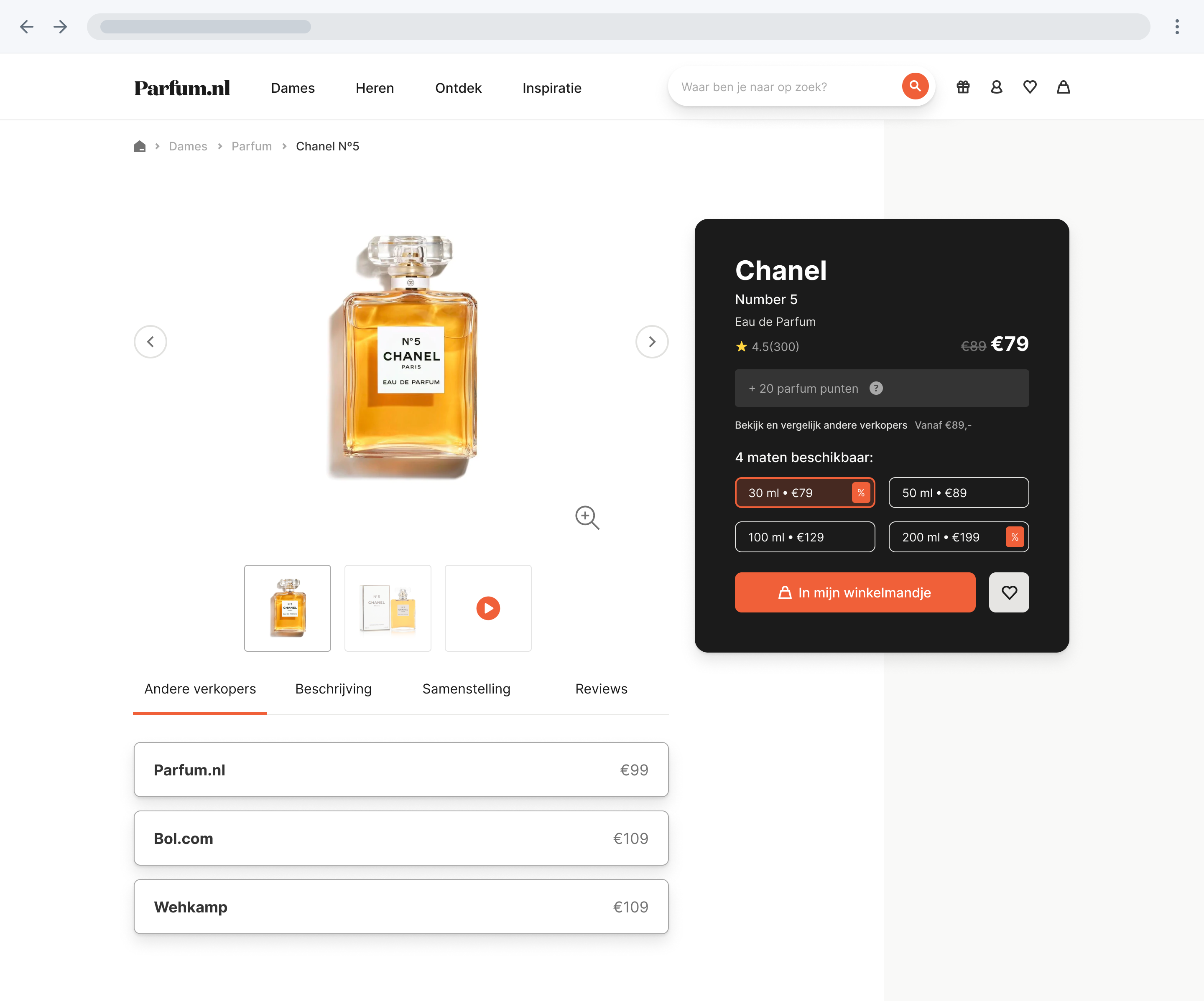
Price transparency
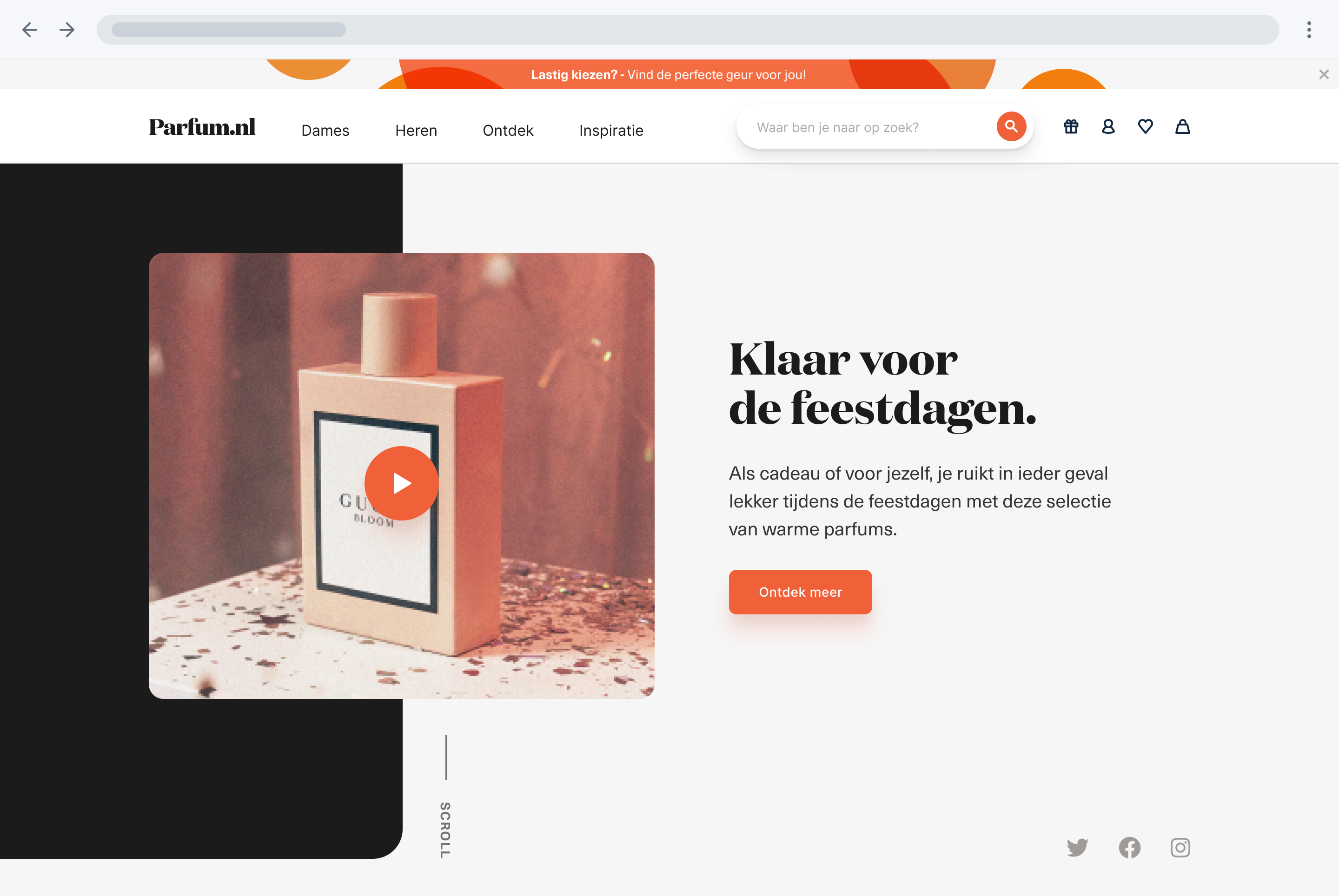
A unique selling point of the website is showing the prices of competitors prominently. This feature is added to build trust with the customer and contribute to a better user experience.


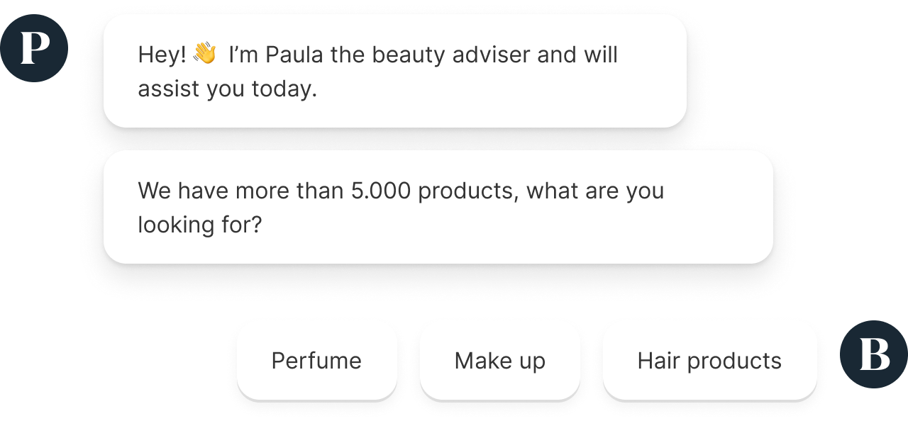
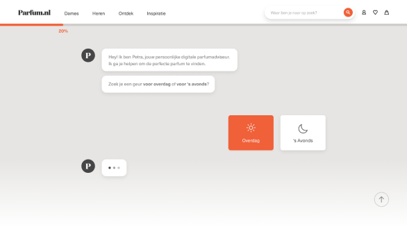
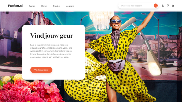
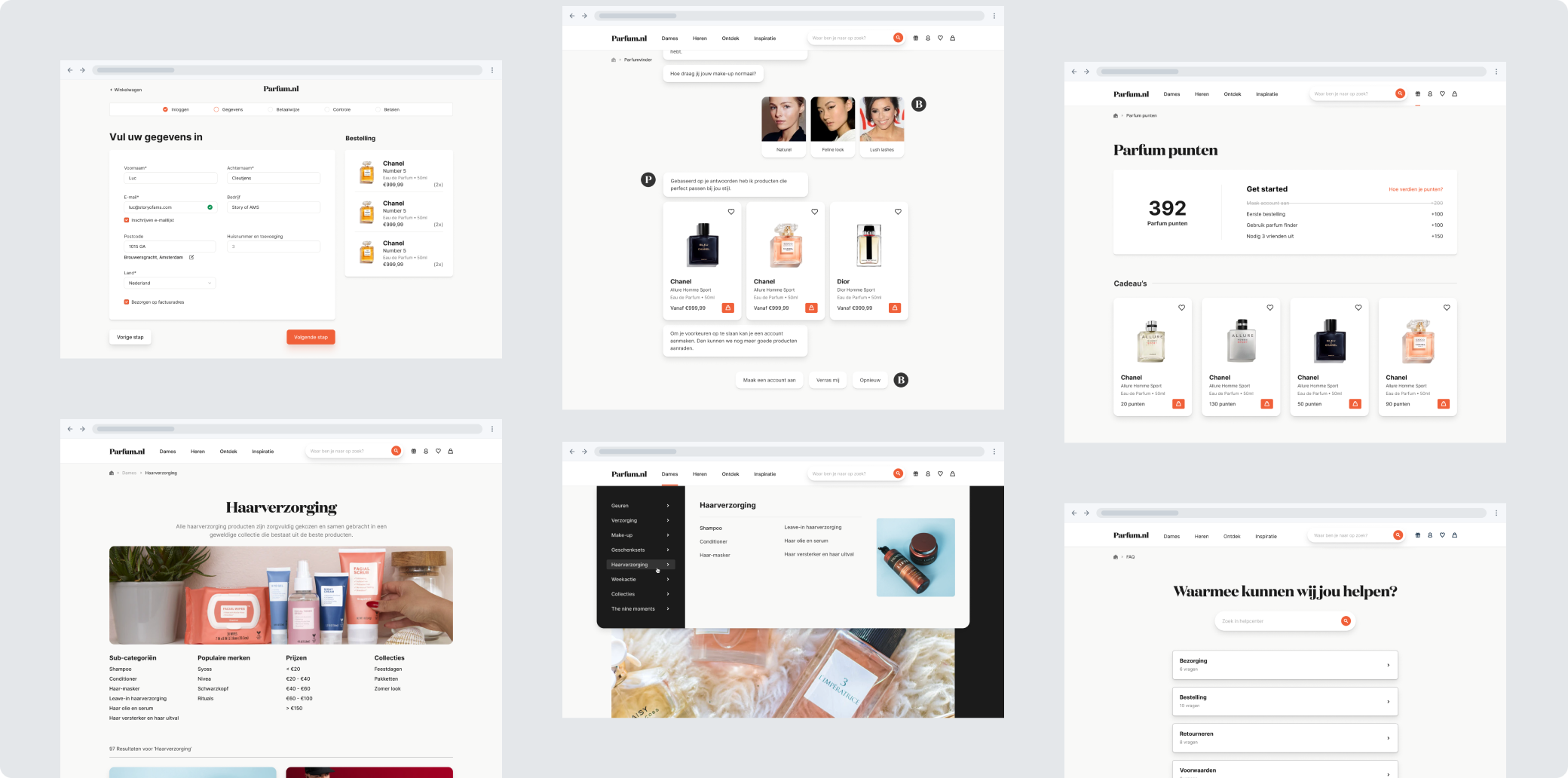
Perfume finder
The amateurs usually go to stores for advice about products, for this group we added the perfume finder. This chatbot proposes products that fit the user after they answered questions.
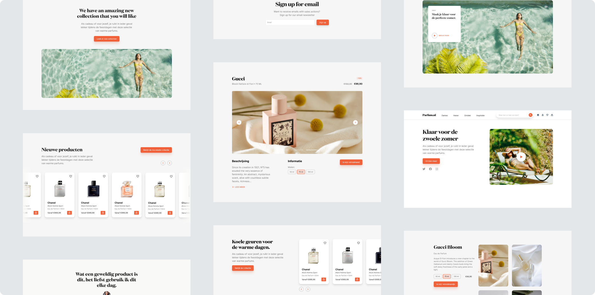
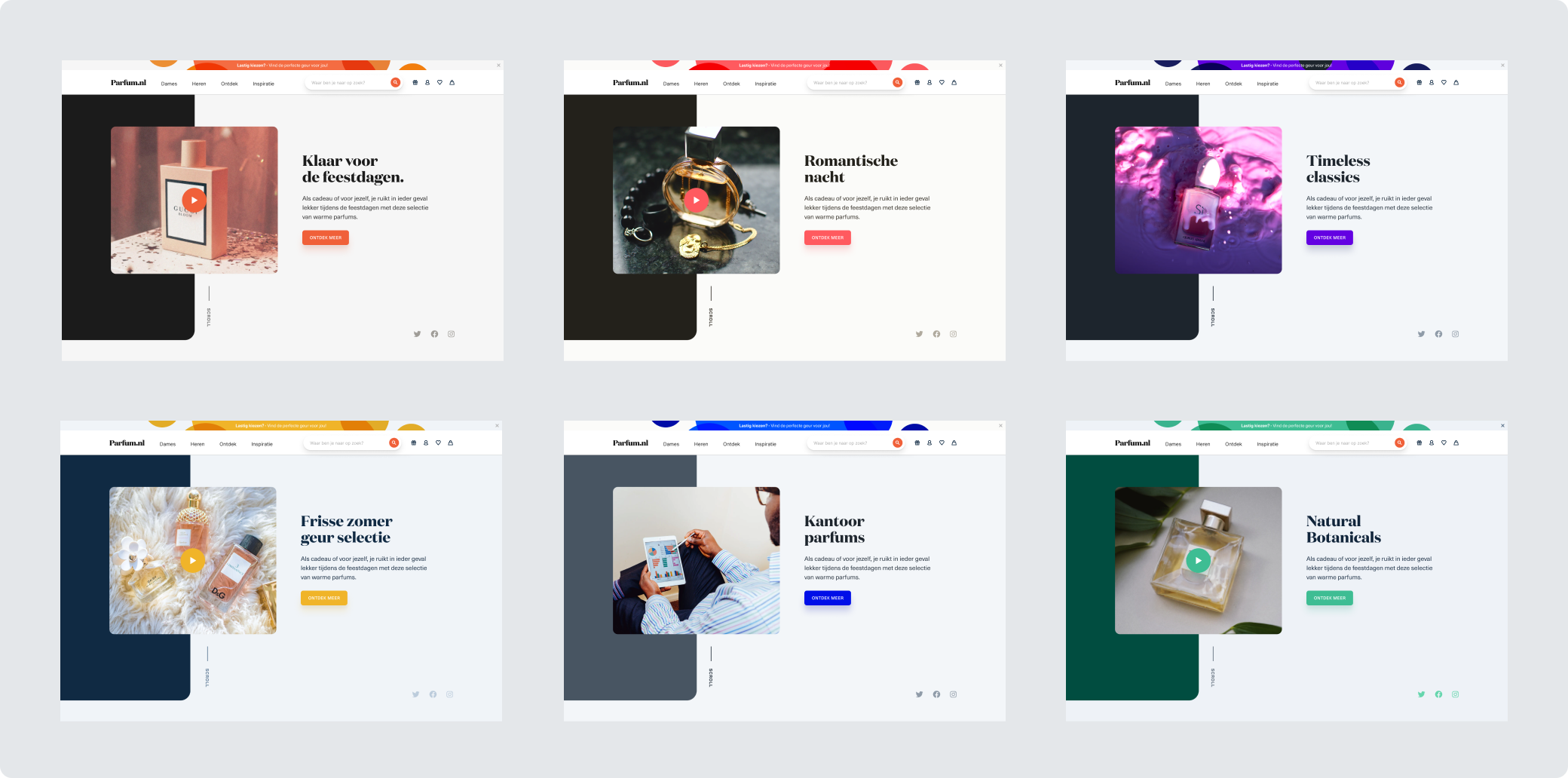
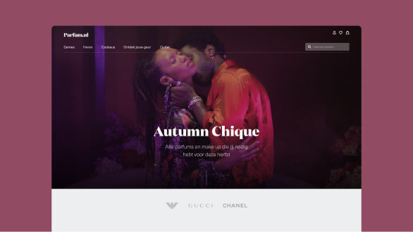
Dynamic landing pages
To help educate the customer more about cosmetics and trying to recreate the offline store experience we build dynamic landing pages. With this feature the client can easily create new pages with pre-build components. We added an extra layer to this feature by giving the client the possibility to choose out of six different color themes for these pages, with this feature the client is able to make over 16 million different combinations of landing pages for their customers.


Design
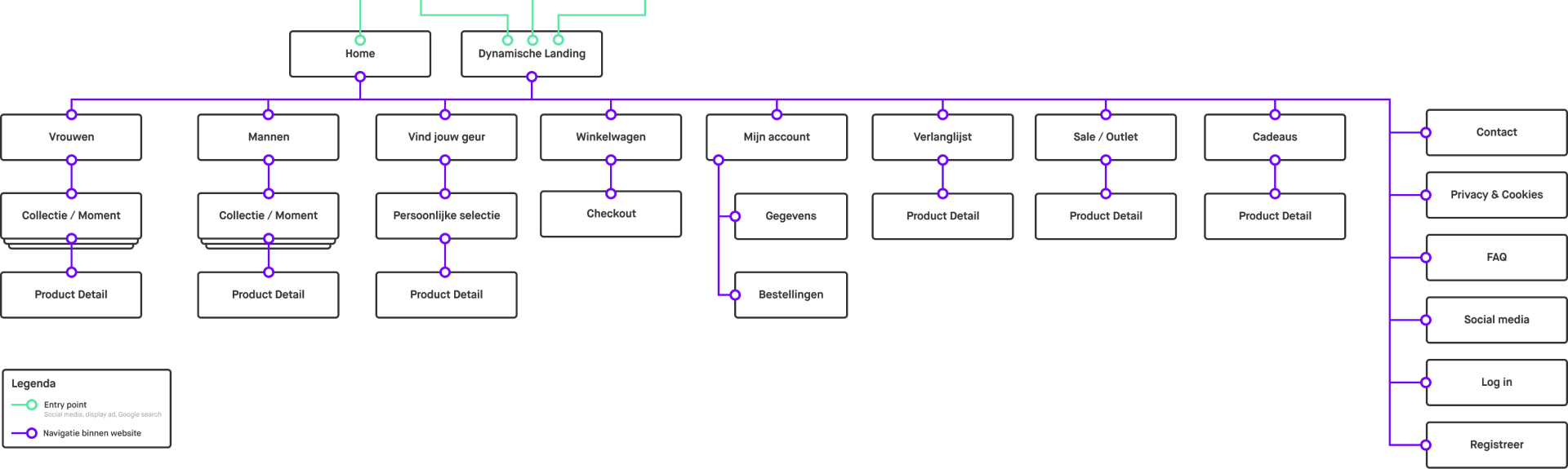
With the branding and concepts done we started with making a sitemap to make clear what pages there should be and how these pages are connected to each other.
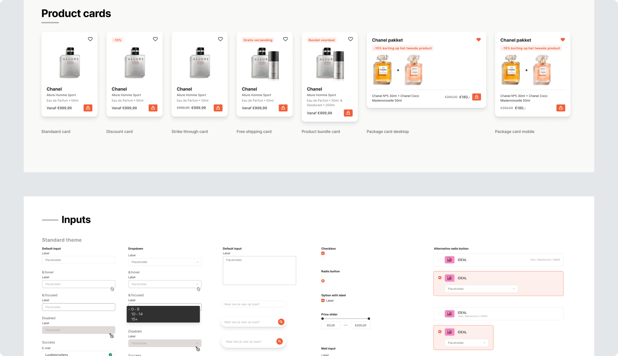
The first designs we made were components and separate sections as a lot of the components would be reused throughout the website.
We worked on different sections on the website every week and discussed those during the weekly feedback sessions. For every feedback session we would prepare an other part of the website, during the first feedback sessions we made the most style changes and the feedback sessions at the end of the project were more focussed on layout and user experience.
From the first explorations till the final iteration we made the design a lot cleaner, better responsive, and got more focussed on the goals of the different users.
Design decisions
- Make the use of organic shapes les prominent on the pages to get more focus on products and content
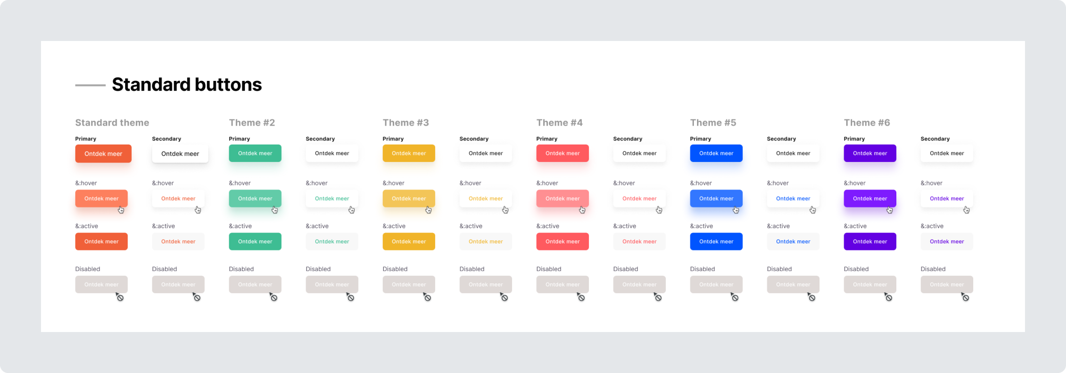
- Use only the primary color for buttons and actions
- Have more contrast between backgrounds and content
- Make often reused components less bulky to be able to fit more of those on a page or single view
- Put the prices of competitors on the top of the product detail page
Final design