mollie
Improving onboarding experience
Helping businesses start selling online, faster.

Helping businesses start selling online, faster.
Mollie is a Payment Service Provider (PSP) that processes online payments for over 80.000 merchants globally. Before being able to process payments, merchants need to complete an onboarding process. The mission for my thesis research was to improve this process so merchants can start earning money faster.
Improve the onboarding for merchants so they can complete it faster.
We researched, redesigned, and prototyped the process which resulted in a full onboarding in the dashboard and made it faster and easier for companies to finish the onboarding with new added features. Also the new design and copy was made to prevent users from making mistakes.
2018-2019 (6 months)
Product designer
Research
UI design
UX design

Every merchant that signs up for Mollie has to complete the onboarding to be able to process payments and receive money. The onboarding is one of the most important and difficult product flows a company can have. It can have a major impact on revenue and is under the remit of several teams. The onboarding process had multiple usability problems that we knew on forehand, but this process was not researched, tested or redesigned in the past 5 years.
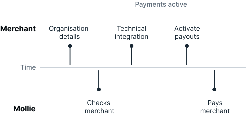
After a merchant created a Mollie account they can start the onboarding process. It is important to know that the onboarding at Mollie consists out of three steps:
Together with the product manager of the onboarding team, we defined all stakeholders of the onboarding process and dove deep into the steps that needed to be completed to be fully onboard. This information made us define two different user groups that we would focus on, business owners and developers. Business owners play a key part in filling in information and developers normally do the technical integration.


We started with understanding the problems, which meant talking to the onboarding- and support team to get familiar with the whole onboarding process and common mistakes made by merchants. The biggest problems that occurred with the users were filling in wrong information or not knowing what the status of the onboarding was.
Together with the Head of Growth, we researched how many users that created an account would actually reach a first payment. This was of great importance since the Mollie software would work in the product of the user and with a first payment the merchant and Mollie are both able to make money. The surprising part of the graph was that more than half of the merchants that filled in their information would not make a first payment. This showed that there are potential problems with the technical integration.

The numbers in the graph are fabricated to give an impression but don’t reflect the real situation
Seeing first-hand how people use the current onboarding was a good way to find out what went through users when doing the onboarding. We tested all steps with the two user groups, merchants and developers. The problems that were raised by the onboarding- and support team were confirmed during these tests. Where the merchants normally make the most mistakes were the steps where test-user took most of the time to understand what was asked from them. The test-users would ask questions about terminology used in the onboarding and could not tell what the status was of the onboarding. When the users finished step one and needed to start step 2, the technical integration, they were lost. They needed to leave the onboarding process and find the right information to start the onboarding and often needed help to succeed.
To get a better understanding from real users we made a pool consisting of over 1000 merchants that recently completed the onboarding and send them an email. Half of them had made a first payment and the other half did not. Insights were gathered from these replies and we planned 10 interviews with users who took longer to complete the onboarding, which indicated that they encountered problems.
From these interviews it became clear that during the onboarding multiple departments with different expertise like finance, development and management were needed. However, the onboarding was designed to be completed by 1 person. This problem also occurred when there were multiple owners of the company, which all need to upload their passport for an ID verification. They could only upload one and needed to provide the other three by email.
By talking to the merchants and reviewing the onboarding process itself afterwards, we concluded that the onboarding was not focussed on user groups’ main goal.
These takeaways were translated into the ‘job story’ format creating goals that the new design should accomplish.
1
When I create a Mollie account I want to activate payments, so I can start selling my products/services
2
When I receive payments I want to activate payouts, so Mollie can do a payout to me
3
When I am busy with the on-boarding I want to know what the status is of the process, so I know if I need to take action
4
When a developer is going to integrate Mollie into my website I want to look up my API key so I can send the API key to the developer
5
When I need the help of other people I want to be able to add them to the process, so they can continue
1
When I have integrated Mollie in a website I want to make a test payment, so I can check if the integration works
2
When I am integrating Mollie in a website I want to have explanations of how the product works, so I can implement it correctly
With a team that consisted out of designers, product managers, and developers, we gathered to brainstorm ideas.We gathered multiple ideas and fit them into one concept that we would breakdown further. The concept is built around the idea to provide the user the information they need to help the company onboard, focussed on the goals of the different user groups.
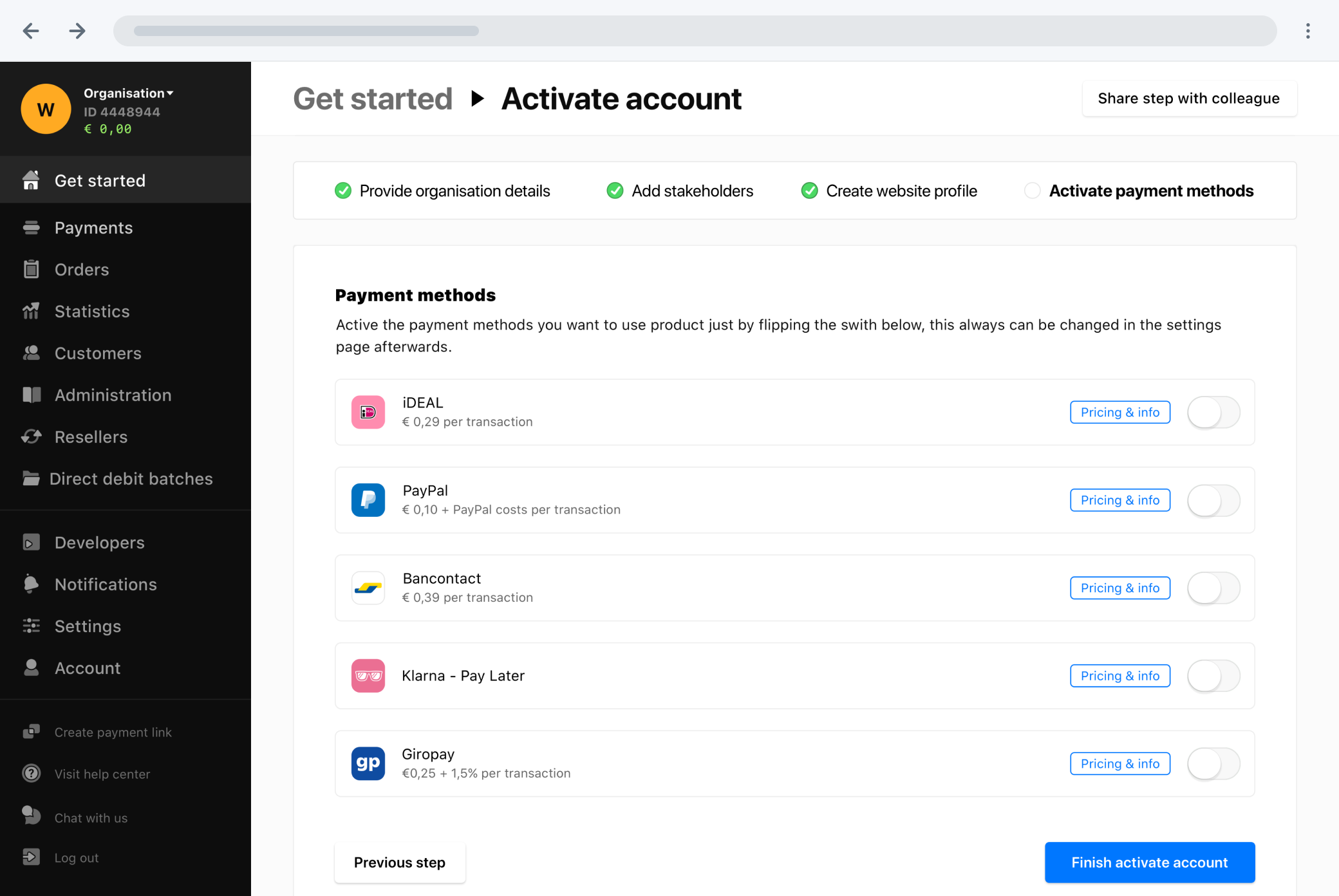
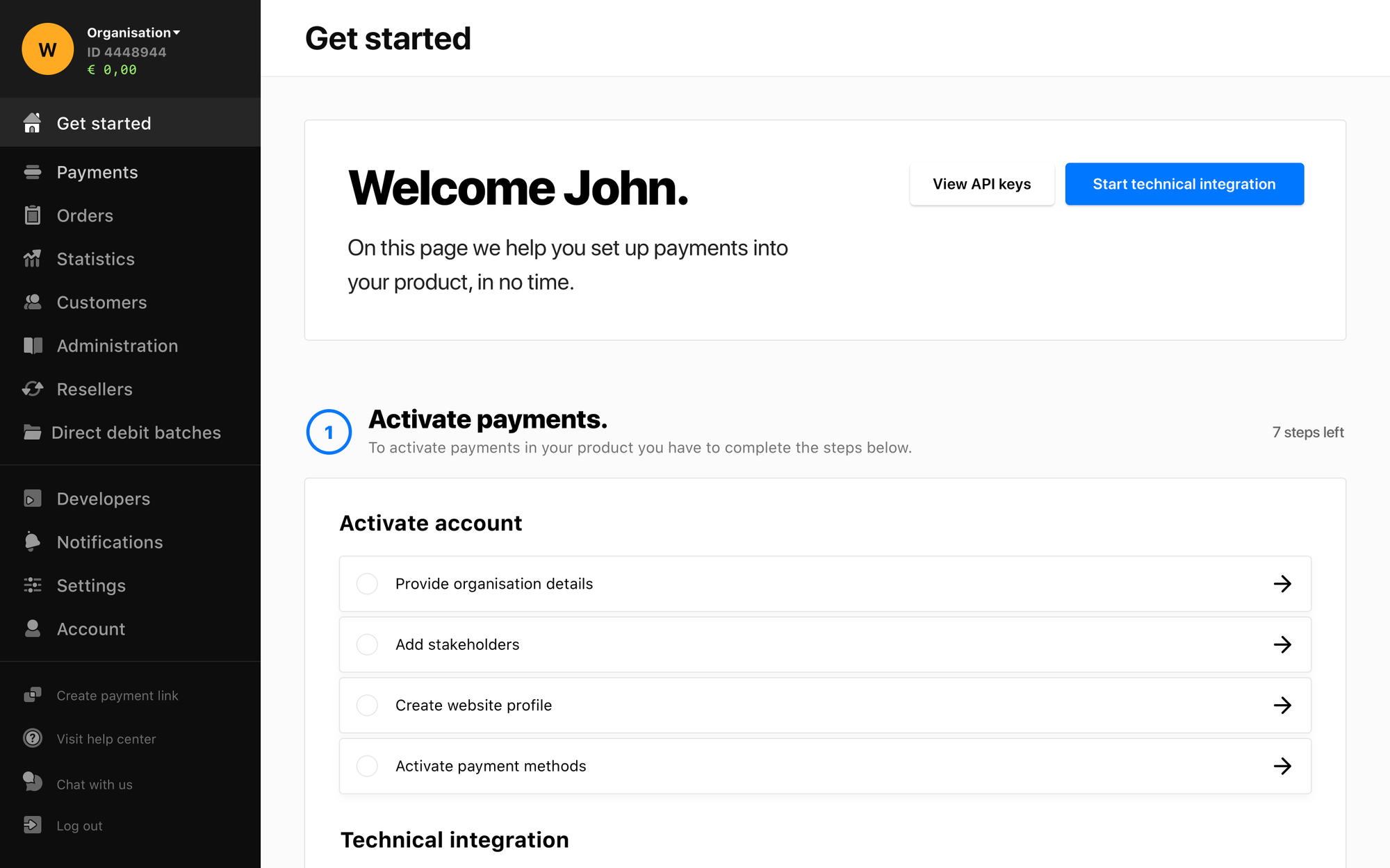
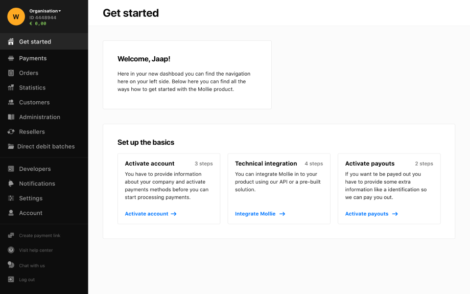
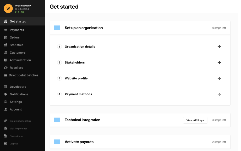
Creating a page in the dashboard dedicated to the main goal of the user → processing payments. This page will offer a clear step-by-step plan for the users to achieve their goal, focussed on preventing faults and providing feedback about the status of the onboarding process.

A lot of ideas were not necessary, but good future add-ons. Therefore, together with the product manager, we decided to prioritise the key features.
Bigger companies need multiple people and departments to finish the onboarding process. By making it easier to invite other people into the onboarding process, it can be completed faster and with less effort.


Interviews with the onboarding team and with merchants pointed out that it is not clear what the status is of the different steps during the onboarding. This resulted in calling the supportteam and delaying the overall process. The new colours and icons make it clear if the task is finished, requires an action, or is declined.


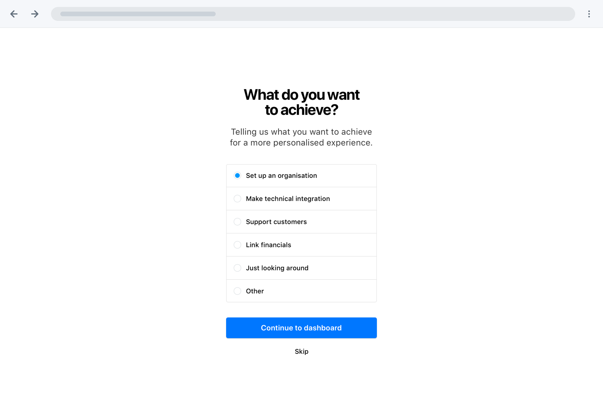
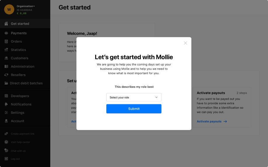
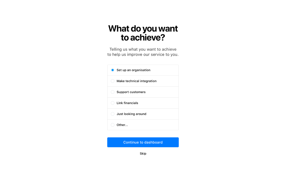
Not all users that sign up, want to start the actual onboarding. A lot of users stop at the first step. To get better data and define why users would sign up in the first place, we will add a screen where the user can tell what he or she wants to achieve. By providing this information the main action for the user can be changed to what would be the best option to achieve that goal.


Bigger companies need more different people and departments to finish the onboarding process. By making it easier to invite other people into the onboarding process it can be completed faster and with less effort.


Merchants made the most mistakes with uploading their identification. Mostly, because they did not upload a photograph that was within the standards. To tackle this problem, we added an image with a description of the standards that explains what is requested.


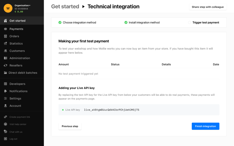
Making a test payment confirms that the technical integration has been successful. At the moment seeing if your test payment succeeded users had to leave the onboarding, in the new flow the test payments will appear in the onboarding itself to give better feedback and requires less searching and clicks.

Before starting with designing, we created a wireflow to show how users can navigate through the pages and the order within the different flows.

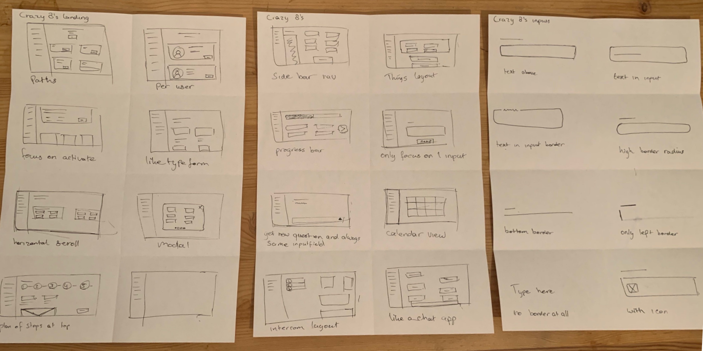
The design phase started by sketching multiple possibilities using the crazy 8’s sketching technique. With this technique you sketch 8 concepts in 8 minutes, which demands to work out a lot of rough ideas in little time. These sketches were used to eventually work outa paper prototype to test the flow of the onboarding. After completing the paper prototype, we started designing the pages and flows on the computer.
Mollie would always offer to start the onboarding process after users signed up, but this does not reflect all user goals. To collect better data about why users sign up, we added a screen after signing up where the user could provide this information. In the first version we asked about their role, but from a design critique we rephrased the question from ‘what describes your role best’ to ‘what do you want to achieve?’.
Version 1
Version 2
The goal of the ‘Get started’ page was to provide feedforward on why and what the user should do to achieve their goal.Three different user test rounds were done to come to the last iteration.During these tests it became clear that the copy was key in how the page was perceived.
Version 1
Version 2

Version 3
To activate payments, the users need to complete two flows, activate account and the technical integration. Interviews with merchants, data analysis, and user tests of the current product showed little problems in the activate account flow. The problems that occurred had mostly to do with bad feedback and feedforward, and explanation of difficult terminology. These problems were fixed by changing the overall UX of the pages and adding better descriptions, while the flow itself stayed same.
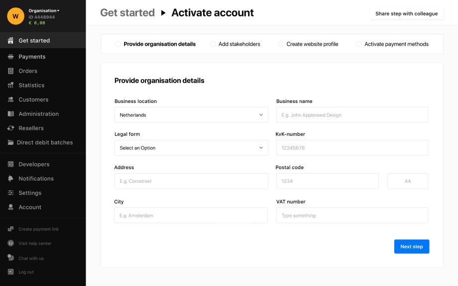
Organisation details
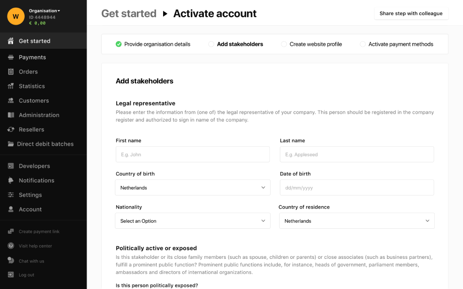
Add stakeholders
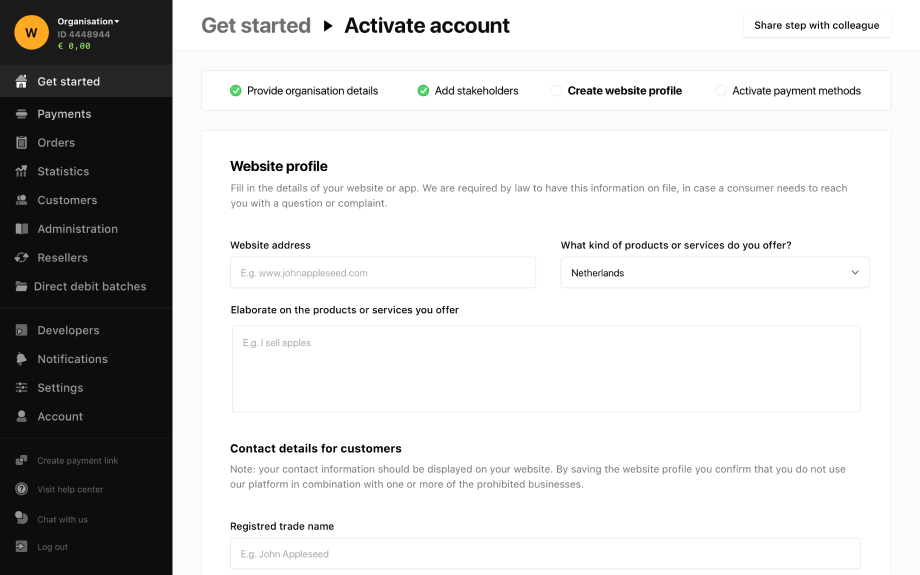
Create website profile
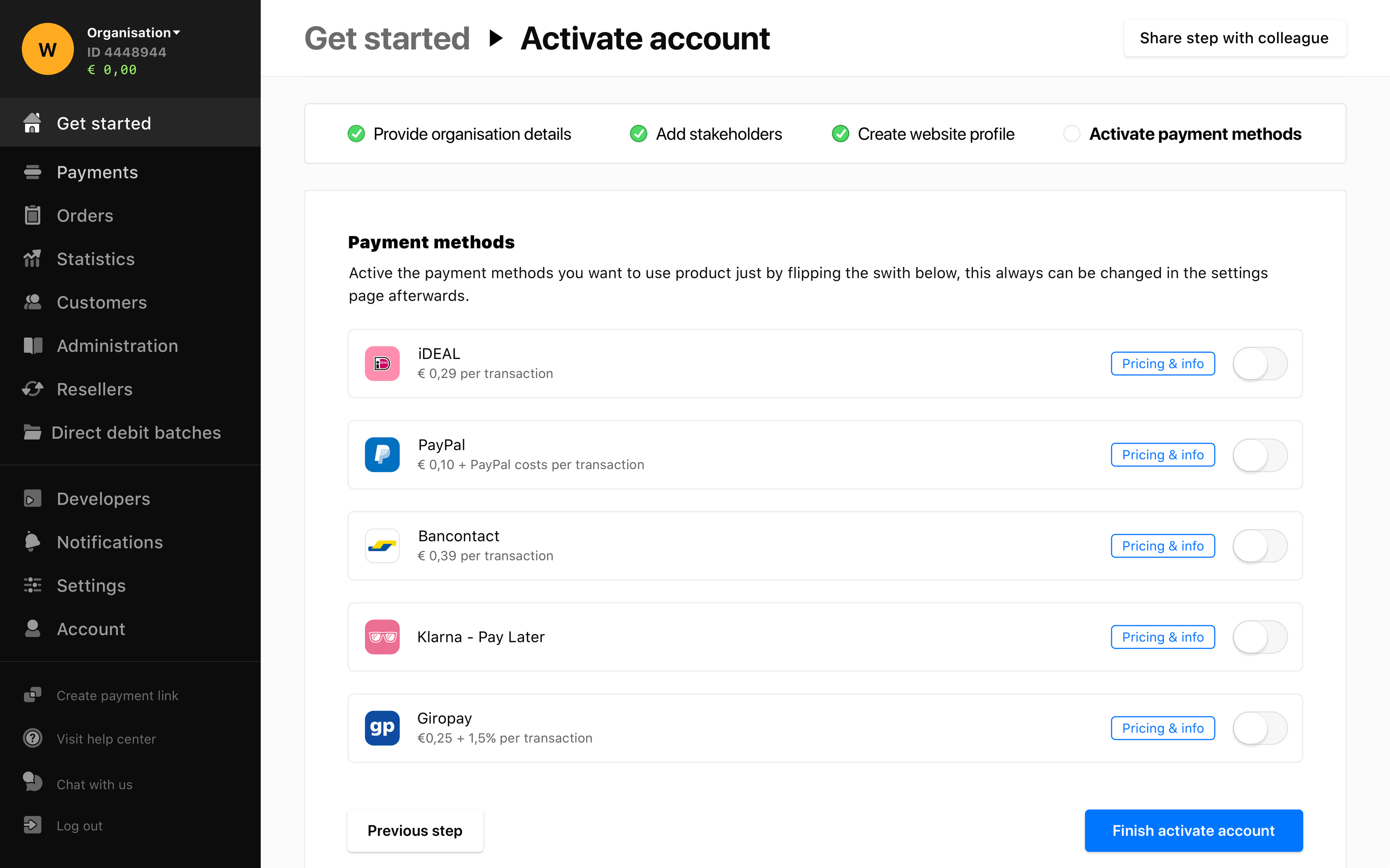
Activate payment methods
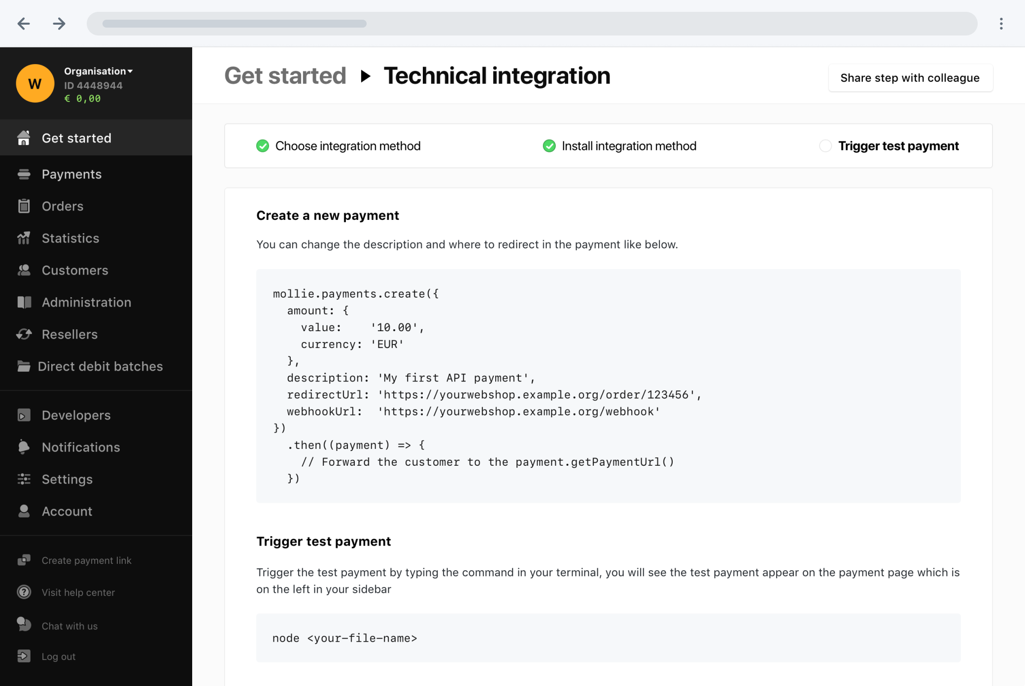
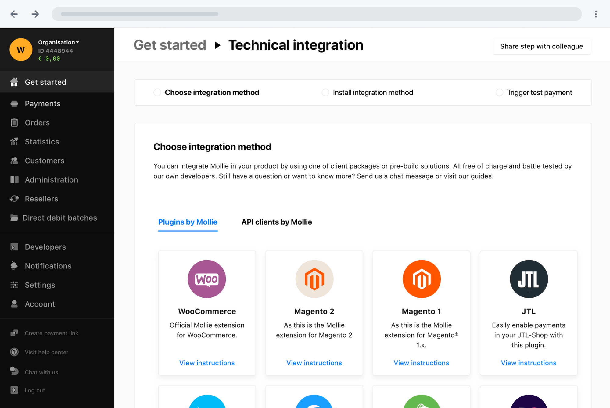
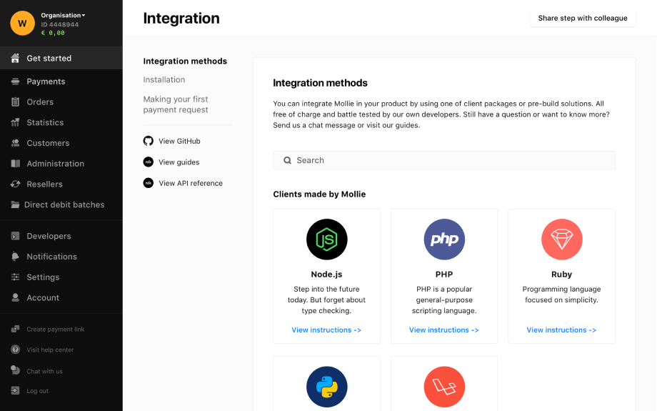
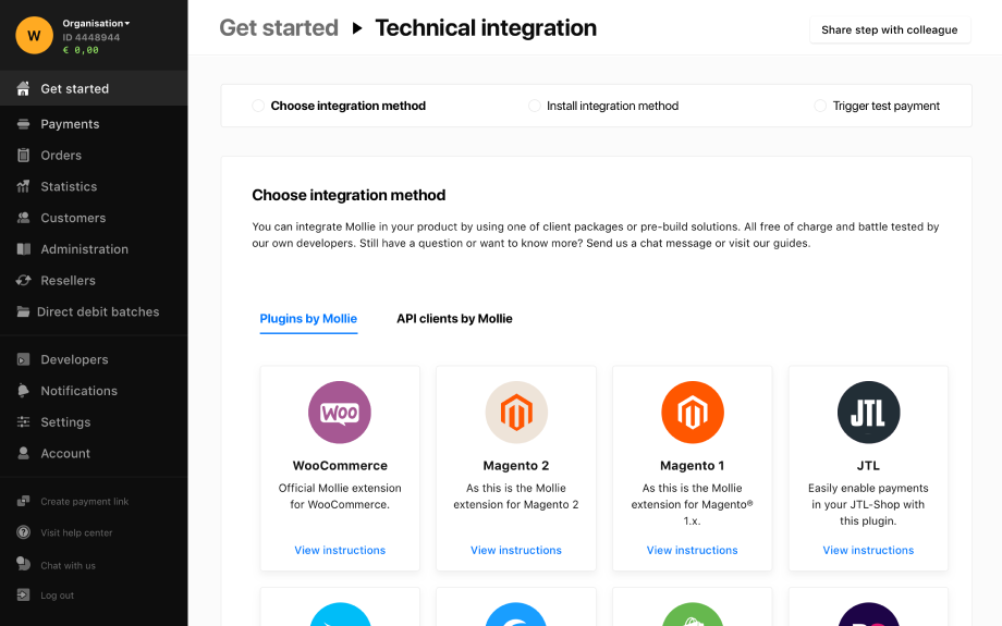
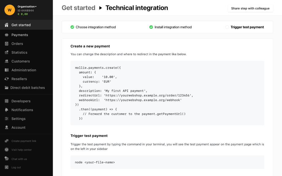
Integrating the Mollie software can be done in two ways, using an API client or a plugin. During the interviews with developers it became clear that developers first want to have a quick check how the API works by doing a test payment, before diving deeper into the integration. In the current situation users had to leave the onboarding and had to find the information in helpdesk or Github. Feedback from the user test showed that this was difficult to find.
To clarify what needed to be done, we added guides and explanations on how to complete the technical integration. We added these to the dashboard to minimise clicks and searching for the right information.
The technical integration is divided into three different sub-steps:
Version 1
Version 2
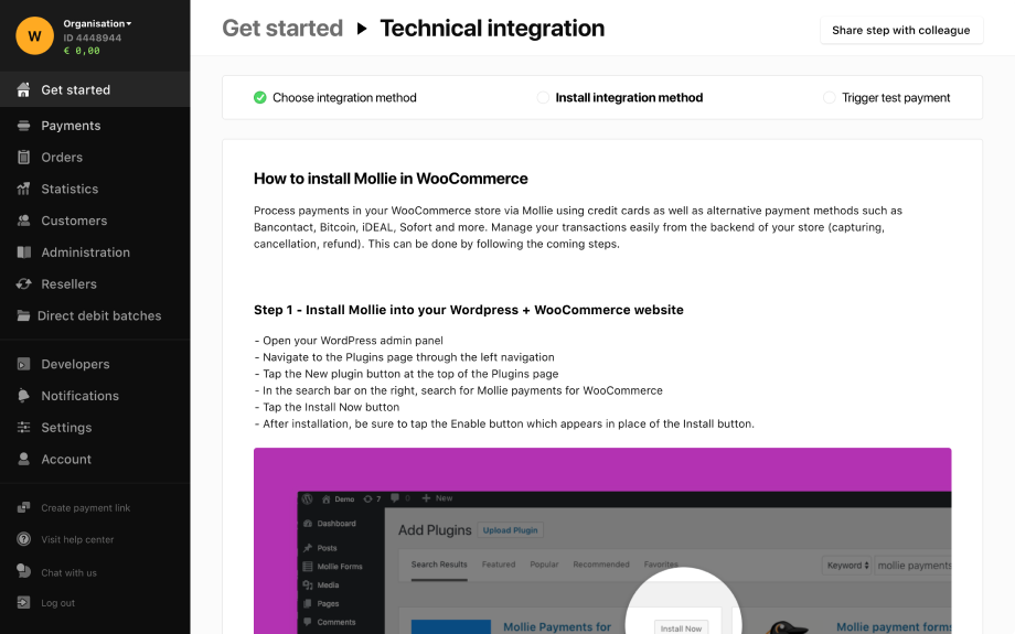
Integration WooCommerce
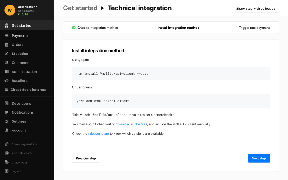
Integration API client
Test payment WooCommerce
Test payment API client
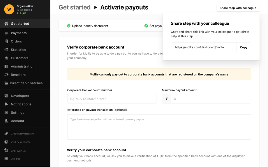
The third step of the onboarding process requires more information about the bank account, a payment frequency, and uploading an ID for verification. The support team said that there were two common mistakes in this step.
To tackle these common mistakes, to ensure that the onboarding team would need a minimal effort to check it and to speed up the process for the user, I made the following decisions:
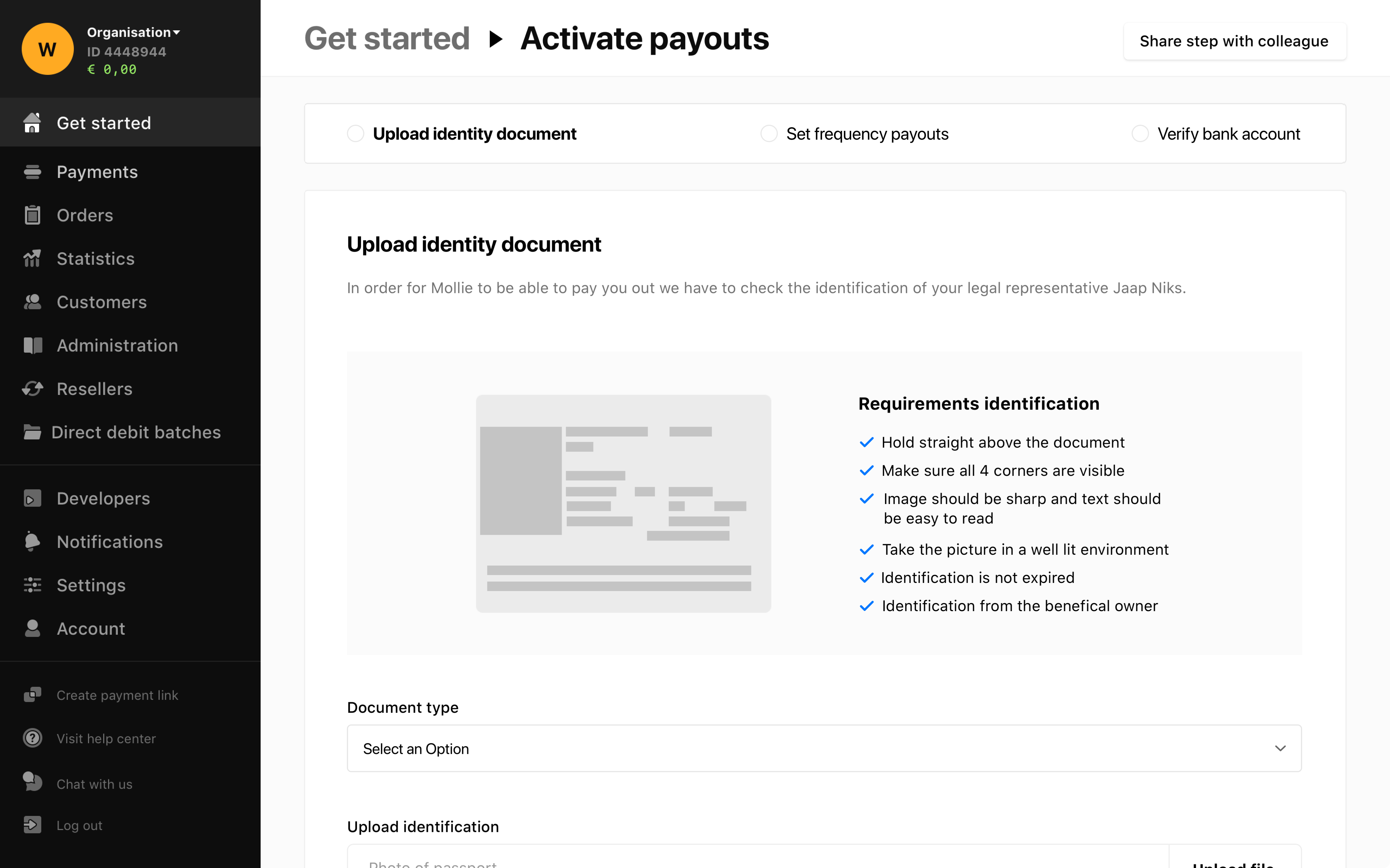
ID verification
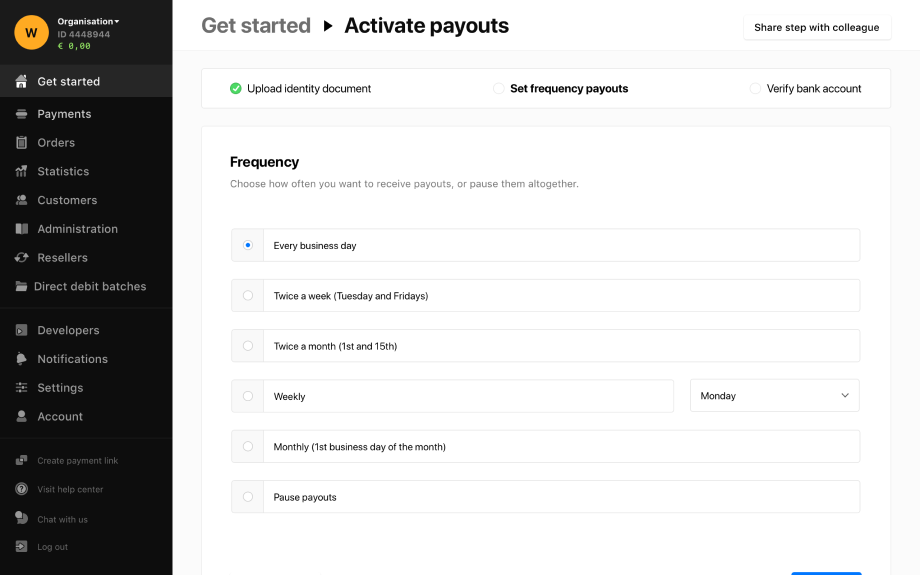
Payment frequency
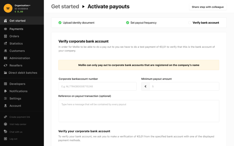
Verify bank account
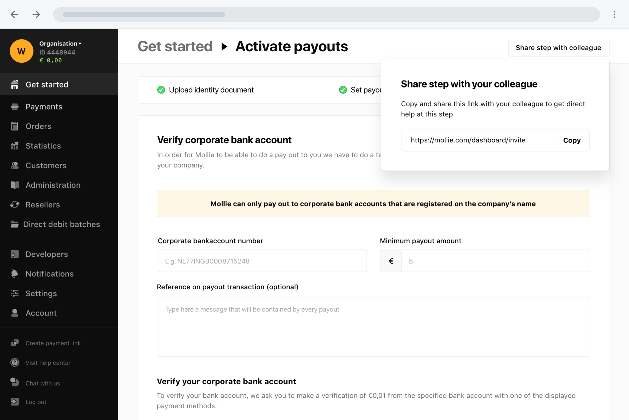
Existing merchants told us that during the onboarding process they would need other people, from for example finance or development, to help them continue. However, since the onboarding process was designed to be completed by a single person, they had to share user names and passwords. To tackle this problem, I decided to add a button on the right top that helps you share a page within the onboarding process, so other people can easily join and help out.